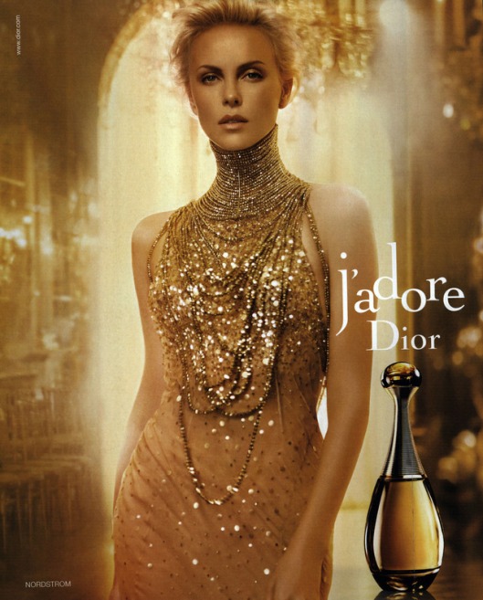
To understand whether or not the visual techniques in this advertisement truly are effective, one must figure out first what the main message is. To do so, I looked at the name of the perfume. J’adore-I love. This title instantly introduces the theme of intimacy and sensuality. There’s also some strength in the statement “I love”, which I believe introduces the theme of power and strength as well. I then analyzed three different visual aspects of the image: color, shape, and repetition. In the end, I found that these assisted in effectively conveying and expressing the main themes of J’adore.
As far as color goes, the use of gold gives the image a warmth and a glow. The way this blends with the woman’s glowing rich skin tone, blonde hair, and sparkling gold dress, further promotes the theme of intimacy/sensuality. At the same time, the use of gold, a color of power and command, adds to the second main theme–power/strength.
The shapes presented in this image also effectively convey these themes. The use of natural shapes, such as the curve of the woman’s body and the similar curve of the bottle, specifically draw attention to the first theme of intimacy/sensuality. The somewhat harsh vertical line directly behind her, however, is what introduces the other theme of power/strength.
Lastly, the use of repetition of color, the fluid use of gold, and shape, the fairly constant use of soft, curvy shapes, truly sells the image by suggesting that the perfume has the power to change you. This is most easily seen in the way that the model appears to almost be a replica of the bottle.
Overall, I think color, shape, and repetition were effective elements in selling an intimate yet powerful perfume that promotes sensuality and womanly strength.

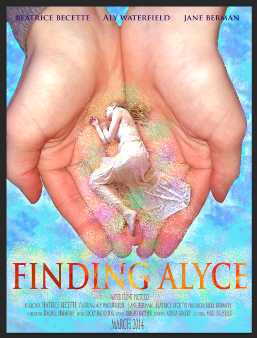
 This is the final version of the movie poster I had to make for class. I created the font using Adobe Illustrator and edited it all on Photoshop. Those are my hands, and I am the person being held. I created the rest using several different brush tools on Photoshop.